
My original design (no I did not draw the tulips!)
My original design (no I did not draw the tulips!)
 Front 2004 - before retouching |
 Back 2004 - before retouching |
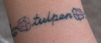
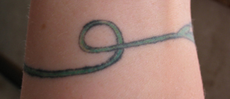
Having already had two languages tattood on me (Chinese and Elvish), I decided I wanted to get something more closely related to me personally, so I chose Dutch as I am from Dutch ancestry. I had also realized my love of gardening at this point in my life, and wanted to represent this in some way through a tattoo. I really liked the wrap-around style of my armband, and decided to go for a wristband. I wanted something 'delicate' so it would look like a bracelet at first glance. I decided to use tulips, having their stems join up as the bracelet around my wrist, and have the flower heads bracket the word 'tulpen' - 'tulips' in Dutch - written in script. I picked a drawing of a tuilp from the internet, and found a font I liked in Word, and put the two together. Unfortunately I have no artistic talent, and had no idea how to turn this into a beautiful tattoo, or how to join the stems on the backside of my wrist. So I took what I had of the design into S.O.S. (which had now become Immaculate Concept) to see what they could do. Steve was all booked up again, so I opted for his brother, Mike Peace. Mike copied my design exactly as it was printed onto my wrist, and then just joined the stems by freehand, with a simple loop. He never suggested better ways to design it, or if other colours would work better. I had a bit of a felling that something wasn't right at the time, and I should have said something, but I was too shy, and assumed he knew what he was doing. I had the flowerheads done in purple, and the flower stem in green, with the text in black. This one took about 45 mins to do. It looked okay at the time, but I wasn't sure about the black outline of both the flower and the stem. After it healed, I noticed that it looked really blotchy in places - the outline was of varying thinckness, and some of it was bleeding into the surrounding skin. Unfortunately I did not think to go back to the shop, and just left it as is. Over time it seemed to get worse.
 Front 2006 - after retouching |
 All the way around 2006 |
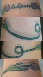
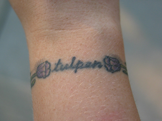
In 2006, I was having another tattoo retouched, and decided to have this one looked at too. At this point S.O.S. had turned into Immaculate Concept and moved to their new location. I met with a new artist, Darren, who specialized in flowers. We discussed my tulip tattoo, and he said it was not a total loss, and that he thought he could fix it up a bit. He did mention, though, that he would not have done the black outline on it at all, instead shading it with darker greens and purples to make it look more realistic. Oh well, hindsight is 20/20! He fixed up the outline so at least it was all consistent, and widened it out from the original line to cover up where the colour had bled. He also redid the purple on the flower heads, highlighted it with some white, and brightened up the green on the stems. Then he added a drop-shadow around the whole thing, to give it some more depth. I am happier with it now that it is fixed, but I still wish I had designed it better in the beginning. Also, because it is in a relatively exposed location, it fades the most of all my tattoos. In the future I may have to get it reworked or covered up by something else to revive it.